The Ember — Grace Fills the Gaps

Grace Fills the Gaps Brand Kit

The Ember, the palette, the type, and the rules for using them. Everything here is downloadable at the bottom.

Story

Grace Fills the Gaps is the Bible-teaching corner of the SteveBailey.me family — scripture opened up and lived in the everyday, one passage at a time. Same hands, same values, same fire; a different room in the same house. This kit is the label for this room.

Every site in the family carries the same mark. The Ember is a single flame over two logs — fire tended, not forced, the through-line of the whole brand. Here it sits over the name Grace Fills the Gaps. It reduces to a silhouette that still reads at sixteen pixels and in one colour, which is the only test a logo really has to pass.

The wider look borrows from the old National Park travel posters — the WPA idiom. Flat vector shapes, confident geometry, a warm and deliberately limited palette shared across the whole family, and a fine grain over the top so the whole thing reads as printed rather than rendered. It should feel made by hand, because that's the point.

The line that travels

The good stuff stays handmade.

Two lines, two jobs. “The good stuff stays handmade” is the family brand line — it goes on every logo lockup, footer and bio across the family. “Grace in the everyday.” is this site’s own hero headline. Don’t swap them.

Logos

Four shapes, each in four treatments. Use the colour versions wherever you can — monochrome exists for one-colour printing, embroidery and engraving, not as a style choice.

Primary

Mark, wordmark and tagline in a row. The default — website headers, letterheads, email signatures.

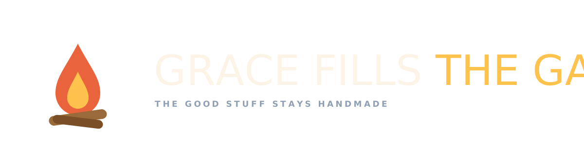
Grace Fills the Gaps primary logo, on light
On light
Grace Fills the Gaps primary logo, on dark
On dark
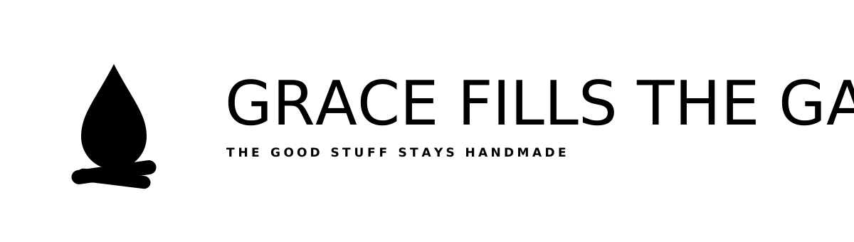
Grace Fills the Gaps primary logo, monochrome black
Monochrome black
Grace Fills the Gaps primary logo, monochrome white
Monochrome white

Square

Stacked into a square. Social profiles, book spines, merch, avatars.

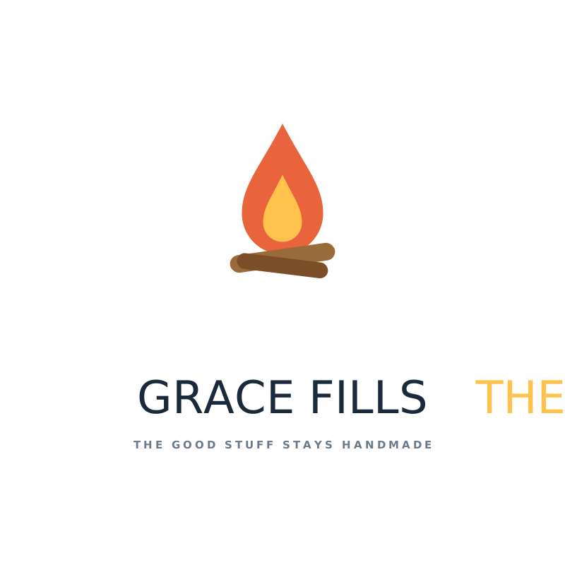
Grace Fills the Gaps square logo, on light
On light
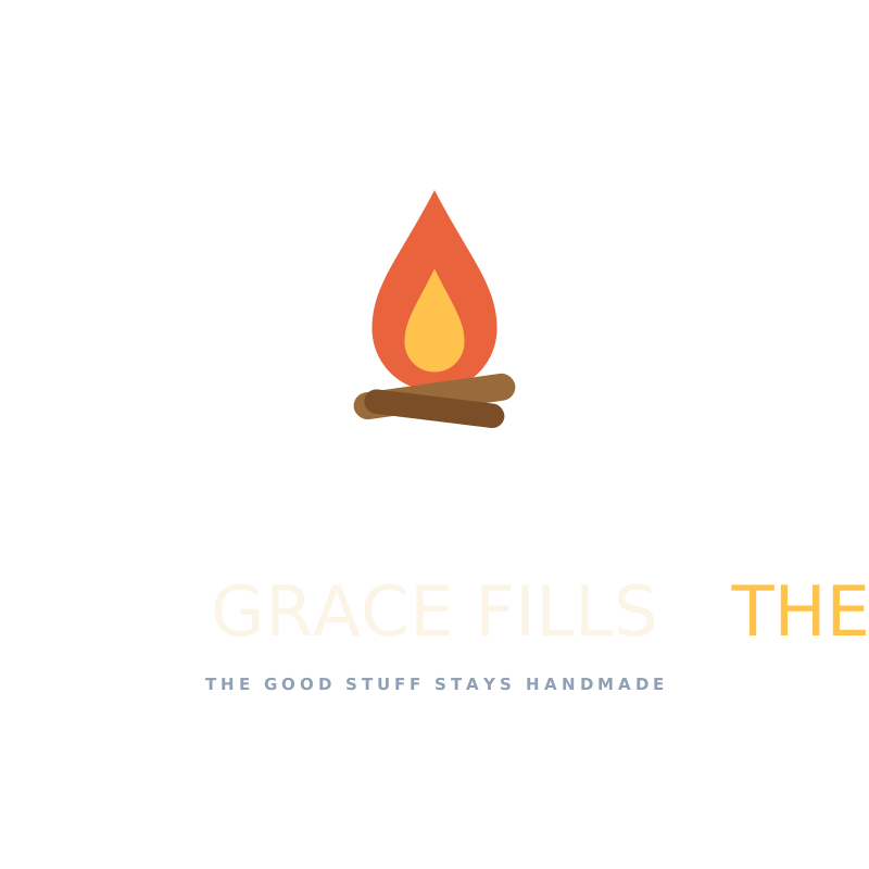
Grace Fills the Gaps square logo, on dark
On dark
Grace Fills the Gaps square logo, monochrome black
Monochrome black
Grace Fills the Gaps square logo, monochrome white
Monochrome white

Icon Mark

The ember alone. Favicons, watermarks, stamps — anywhere the name is already present.

Grace Fills the Gaps icon mark, on light
On light
Grace Fills the Gaps icon mark, on dark
On dark
Grace Fills the Gaps icon mark, monochrome black
Monochrome black
Grace Fills the Gaps icon mark, monochrome white
Monochrome white

Wordmark

Type only. Where the mark appears elsewhere on the same surface.

Grace Fills the Gaps wordmark, on light
On light
Grace Fills the Gaps wordmark, on dark
On dark
Grace Fills the Gaps wordmark, monochrome black
Monochrome black
Grace Fills the Gaps wordmark, monochrome white
Monochrome white
The fonts are embedded. Anton and Nunito travel inside every wordmark and lockup SVG, so the files render correctly anywhere — no font install needed — while the type stays crisp at any size.

Colors

The whole family shares one palette. Cream is the default ground, navy the anchor, and coral the flame’s accent — used sparingly so it keeps its punch.

Ember Coral
HEX
#E9633C
RGB
233, 99, 60
CMYK
0, 58, 74, 9
Flame, the .ME, buttons and links
Late Sun
HEX
#FFC24D
RGB
255, 194, 77
CMYK
0, 24, 70, 0
Inner flame, highlights, accents on dark
Deep Navy
HEX
#16376B
RGB
22, 55, 107
CMYK
79, 49, 0, 58
Anchor. Hero, panels, the app tile
Navy Deep
HEX
#0F2650
RGB
15, 38, 80
CMYK
81, 52, 0, 69
Footer, deepest ground
Lake Blue
HEX
#2E86C8
RGB
46, 134, 200
CMYK
77, 33, 0, 22
Secondary blue, water
Paper Cream
HEX
#FCF5E7
RGB
252, 245, 231
CMYK
0, 3, 8, 1
The page. Preferred light ground
Pine
HEX
#1F6152
RGB
31, 97, 82
CMYK
68, 0, 15, 62
Scenery, foliage
Ink
HEX
#1B2A3A
RGB
27, 42, 58
CMYK
53, 28, 0, 77
Body text, wordmark on light
On the CMYK values: these are a straight arithmetic conversion, fine for office printing and digital proofs. For anything commercially printed, give your printer the HEX values and let them convert against the actual paper and press profile — especially for the coral, which sits outside a lot of coated CMYK gamuts and can print muddy if nobody's paying attention.

Typography

Two faces, three jobs. Both are free and available from Google Fonts.

Display — Anton, 400 (sentence case, never all caps)

Nothing good gets rushed.

Label — Nunito 800, uppercase, .2em tracking

Around the Fire — 01

Body — Nunito 400, capped at 64 characters per line

I'm Steve Bailey, 65, in no particular hurry. I'm a husband and a father. I love my church, family, and my friends.

Anton ships in a single weight. There is no bold. Asking a browser or a design app for Anton 700 gets you a synthesised fake that thickens the strokes unevenly and muddies the letterforms. Load and use 400 only.

Guidelines

Clear space: keep a margin equal to the height of the flame on all sides, and put nothing in it.
Minimum sizes: icon 16px / 8mm · primary 120px / 30mm · square 100px / 25mm · wordmark 140px / 35mm.

Do

  • Use the colour version whenever the background allows it
  • Switch to the white version on anything dark — never the colour or black one
  • Scale proportionally, always
  • Drop to the icon mark rather than shrinking a lockup past legibility
  • Place it on cream, navy or a plain photograph area with room to breathe

Don't

  • Recolour the flame outside the palette above
  • Add drop shadows, gradients, outlines, glows or bevels
  • Stretch, squash, skew or rotate
  • Rebuild the lockup by retyping the name next to the mark — the spacing is deliberate
  • Place it over a busy part of a photograph
  • Shrink the primary lockup below 120px; the tagline stops being legible and the whole thing reads as mud

Downloads

Two kits, plus a print note. Take the SVG kit unless you have a specific reason not to — it's the master, it scales forever, and Illustrator opens it natively.

SVG KitAll 16 lockups plus the app icon, as scalable vectors with fonts embedded. Opens in Illustrator, Figma, Affinity, or straight into a website.Download · SVG Raster KitTransparent PNGs at 300, 600 and 1200px, JPEGs at 1200px with backgrounds baked in, and the complete favicon set.Download · PNG + JPG
Print / PDFEvery logo SVG carries its fonts inside it, so a printer or vendor can open them straight in Illustrator or Affinity and export PDF, EPS or PDF/X at any size — no tracing, no quality loss.Vector · from the SVG kit
Asked for Illustrator files? Modern .ai files are PDFs underneath. Illustrator opens both the SVGs and the PDFs here natively, with fully live editable paths — no tracing, no quality loss. If a vendor insists on the literal extension, open the PDF and do File → Save As → Illustrator.